Sunday, 18 December 2011

Evaluation

In what ways does your media product use, develop or challenge forms and conventions of real media products?


As in our feedback, people felt we fitted and formed to the conventions well, however we also pushed the boundaries of music videos in general. It is quite different to what is around currently with the jerkier, quirkier, faster pace to it along with a different style of editing. It pushes the narrative and leaves the audience to make their own conclusion. We tried to delve deeper into the lyrics and take a different spin on what could have been a very literal song. The ancillary texts are also more exaggerated than what is around so forms well to the genre but in a more general sense pushes the conventions in place to adverts and CD albums. However the genre we have picked allows these boundaries to be pushed.  


How effective is the combination of your main product and ancillary texts?


I feel they compliment each other well, the same theme runs throughout both which I feel is key to keep the audience interested and so they are able to make connections between the two. Hopefully with the texts having the same theme it helps them to be distinguished more easily on a shop shelf for instance. If the consumer has already seen a poster and sees a digipak it would remind them of that poster (and vice versa) and would therefore increase sales if it has a sense of familiarity. I also feel the pictures I chose will emote a sense of curiosity and invite the audience in so they may then watch the video, visit the website or buy the CD and generally promote interest around the band. I used the same fonts, colours and similar photos, all to develop a brand and image for the band which gives them something to be known by and the audience something to relate to. Overall I feel the combination is highly effective, the main product fits well with the ancillary texts and moulds to the conventions. The theme is recurrent throughout giving it recognition with the audience.


What have you learned from your audience feedback?


We learned a lot from the feedback and it helped so much to have fresh eye and opinion of our video. We had become to wrapped up in it and it became difficult to see it objectively. However, we now know, we could have made it simpler and that it definitely needed to include some form of fight scene between the boyfriend and girlfriend to make it more clear that they had split up. We were pleased to learn people thought we fitted well with the conventions of the genre & that the lip syncing was done very well. Also we have learned that perhaps the audience need to watch the video more than once to really take everything from it and understand it.


How did you use media technologies in the construction and research, planning and evaluation stages?


In the planning and research stage we used the Internet and search engines to study other similar music videos and to gain information about our inspirations and the conventions of our genre. In the actual filming of our video we used digital technology. This included a variety of cameras, which consisted of a handheld to film the majority of the video and in the TV studio we took advantage of the facilities avaliable. We then used a software programmer called Adobe Premier Pro to edit and finalise the video. For our pictures of locations, make up and star image we used a Nikon camera. We often used our mobile phones (mine being a Samsung Wave) to send or bluetooth various necessary pictures to one another as well as e-mailing them and uploading them to social networking sites to share them. I used blogger throughout the project to document all the progress also.

Friday, 16 December 2011

Research and Planning

Digipak

Album Advert

Audience Feedback

We gave out questionnaires for people to fill in so we could get feedback on what other people thought of our video. One of the questions was a mark out of 10, 10 being the highest. We took an average of the marks and out of 10 it was 7.83 – which rounded up to 8.
A vital point we really wanted people to grasp was the narrative as we really took time trying to subtly getting across the narrative. Most of the feedback said they understood the narrative – however we could have made it clearer. A comment we were pleased with is that all the responses said we followed the conventions of the genre well. A lot of time went into finding our inspirations of the genre and we idolised a lot of people from the genre so we were pleased to find out other people agreed we fitted well into that niche. Peers commented saying it could have been improved by toning it down a bit and using more lip syncing. However the feedback said we didn’t have any syncing issues and they agreed that the editing was fitting with the video and was cut in time to the music. We were pleased with this as one of the key points is the lip syncing and how well it is cut with the music and being in time with the music so to have achieved this was a big success. People commented that after watching it they felt, entertained, randy, scared, excited and confused.

Wednesday, 14 December 2011

Freakshow - Funhouse


Above is our final edit of our music video "Funhouse".

Digipak Research

When looking into creating my digipak, I chose to study Paramore's second album "RIOT!". 


The front cover of the album is sketchbook like. It features scribbles of the word "RIOT!" in the background. However on closer inspection it is evident that the writing is credits for the album.
The album title, "RIOT!" stands out the most on the cover, it’s one of the few bits of text written in colour and in this case the chosen font colour of orange takes a very central position on the cover. An image of the band is located directly below the album title in black and white and has been edited to give it a sketch-like look which fits in with the rest of the cover.
It isn't possible to see the whole of the album cover as a promotional sticker has been added at some stage in the production process. However I found another more generic picture of the album cover.


I noticed that the band’s name (Paramore) is not in the album artwork as a main title. The band’s name is instead on the area by the hinge of the album. It is also featured in the top right hand corner where it says "Paramore is..." and goes to list the band members and their roles. This is perhaps because its their second album, their image has been developed and is well known enough for them to be known simply through a picture and the name "Paramore" was no longer necessary on the cover for them to be identified. However, the sticker may have been added as it was confusing and in turn hindering sales.


The "RIOT!" scribble theme is present on the back cover of the album with the word "RIOT!" written in black with some information written in orange. The back cover features a track listing in orange above another black and white image of the band with a sketch like effect applied. The band look very close together and this gives an impression that they all get on and are happy. The image takes a central position on the lower half of the cover with the band looking directly at the "listener" who is looking at the cover. The band and their record label’s web addresses are also featured on the back cover along  with the barcode and copyright information.


The album’s insert, pictured above, further cements the notebook theme. All the font is in a scribbly style and looks childlike. Images of the band are again present and in the same style as with the rest of the panels. The insert includes the lyrics to four of their most well known songs with extra notes and doodles alongside. It feels quite personal and as though they are sharing intimate details with their fans. The whole album package with it’s notebook theme gives the sense of envy, anger and frustration with the constant doodles and almost rigid font. This angst is reflected in the songs on the album, for instance in the songs "Misery Business" and "That's What You Get". It’s clear to the listener that the theme of the album as a whole is reflected not only through the music but also through the album packaging. From the black and white contrasted with the orange, to the way the band are dressed in the album’s photographs is reflective of the pop-punk genre and conforms exactly to it. This is something that a lot of the band's audience can relate to as the band are pictured wearing fashionable items of clothing and the font used is very reflective of the emo style which some of their listeners choose to take up.
I feel that the cover for "RIOT!" is one of the best I have seen and going through this analysis process has made me realise just how good it is and the amount of hard work and thought that has gone into creating it.

Monday, 12 December 2011

1st Draft Storyboard

Research - Questionnaire Feedback

 These are a set of questions we asked our peers just after we had decided which song we wanted to use for the project. This gave us an idea of what was popular and what the views were on receiving music in the medium of video.  


A fundamental part of the project was satisfied when this was the feedback we gained for this question. Over 3/4s of the group watch music videos, proving it is a hugely popular tool and a way artists can express themselves, to a massive audience.  


The majority of the group watch music videos on YouTube and a small proportion do so on a television. The Internet plays host to a captive audience, and many videos go 'viral' when they shared on various social networks. Starts such as Lady Gaga and Justin Bieber's music videos have been watched by over 2 billion people!


The feedback was quite split with this question, many people hadn't bought a CD in the last 2 years, whereas others were still buying CDs fairly regularly.


 3/4s of the people we asked about when they had last downloaded music had done so in the space of a week, be it 2 days ago, last night or a week ago. Showing this is an extremely popular way of accessing music.


Such a wide spectrum of music genres are available, this is represented here in the graph above, with 9 different genres of music coming from a small group, this shows how diverse music is becoming.


iTunes and HMV are the big suppliers of music and this is represented here, many people answered this question with them as the place they recently bought music from.

Friday, 9 December 2011

Planning - Initial Brainstorming


Above is our mood board, this is where we came up with our first ideas, and what we thought the lyrics meant & how we would want to portray them in our video.
We liked the combination of freaky, evil, scary clowns and monsters to represent the issue of domestic abuse.


Above is our first attempt of annotating the lyrics and thinking through what we would like to do for our video. The pink is locations and the blue represents the ideas and what we would film. The first session of brainstorming was very useful and gave us an idea of what route we wanted to take with the video.

Tuesday, 6 December 2011

History of Music Videos

A music video is a short film combining a song and imagery, made for promotional or artistic purposes. Modern music videos are primarily made and used as a marketing device intended to promote the artist and their songs to increase sales. Although the origins of music videos date back, they came into existince in the 1980s, when MTV based their format around the videos.


Music videos use a wide range of styles of film making techniques, including animation, live action filming, documentaries, and abstract filming. Some music videos blend different styles, such as animation and live action. Many music videos do not interpret images from the song's lyrics, making it less literal than expected. Other music videos may be without a set concept, being merely a filmed version of the song's live performance.


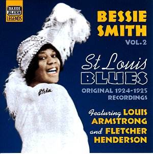
An early example of a music video is St Louis Blue’s – Bessie Smith 1929.
Blues singer Bessie Smith appeared in a two-reel short film called Saint Louis Blues, featuring a dramatized performance of the hit song. It was so successful it was shown in theatres until 1932. In 1940, Walt Disney released 'Fantasia', an animated film based around famous pieces of classical music.


The Beatles took the videos to new heights with their groundbreaking films for 'Strawberry Fields Forever' and 'Penny Lane' made in early 1967, which used techniques, such as reversed film effects, dramatic lighting, unusual camera angles and rhythmic editing. These two landmark films are among the very first purpose-made concept videos that attempt to illustrate the song in an artful manner, rather than just creating a film of an idealized performance.


In the UK the importance of Top of the Pops to promote a single created an environment of innovation and competition amongst bands and record labels as the show producers placed strict limits on the number of videos it would use - therefore a good video would increase a songs sales as viewers hoped to see the video again the following week.


Queen's Bohemian Rhapsody also started a whole new era for using music videos as promos. In 1981, MTV launched, the first video played was 'Video Killed the Radio Star' by the Buggles. David Bowie scored his first UK number one in nearly a decade thanks to director David Mallets' eye catching promo for Ashes to Ashes.


In the early to mid 1980s, artists started to use more sophisticated effects in their videos, and added a storyline or plot to the music video. Michael Jackson was the first artist to create the concept of the short film. A short film is a music video that has a beginning, middle and end. He did this in a small way with Billie Jean, it wasn't until the 1984 release of the 'Thriller' short film that he took the music video format to another level.


Top of the Pops was censorous in it’s approach to video content, so another approach was for an act to produce a promo that would be banned or edited and so use the resulting controversy and publicity to promote the release. Early examples of this tactic were Duran Duran's, 'Girls on Film' and 'Frankie Goes to Hollywood'.
Music videos represent a crucial part of the music industry. Artists owe their careers to music videos as they are being given the chance of impressing the public not just with their vocal talent, but also with their looks or moves.


 Nowadays, the music video is as important as the song itself, sometimes even deciding the success of a song or artist. Collections of music videos are being sold on tapes or DVDs. Music video's greatest fans are apparently watching them muted just to enjoy their artistic value, as they consider it to be a new form of art.
For the last two decades of the 20th century, the music industry rotated along the axis of MTV. The company represented a direct line into the hearts and minds of music consumers around the world, and the their main form of expression was music video. When MTV launched in August 1981 and blasted “Video Killed The Radio Star” through North American households, it represented the ambitions of a company who wanted to significantly influence popular culture. It succeeded in a big way, earning $7 million in advertising revenue in the first 18 months, and remained a critical part of the music industry by leveraging music videos to help expand the image of acts as diverse as Michael Jackson and Green Day, Guns n’ Roses and 2Pac.


Thursday, 1 December 2011

Inspirations


These outfits Pink is wearing inspired us to do a 'freaky' and 'circusy' theme for our video. The lyrics also evoke a circus atmosphere. The contrasting stripes and vibrant colours in her outfits encouraged us to do something similar.


We liked Mika's video "Rain" http://www.youtube.com/watch?v=5WK-vRhz9xs&ob=av2n - it gave us more ideas to create a more errie version of 'Funhouse'. The big chase scene towards the end is also something we wanted to recreate in our own way.


Florence and the Machine's song "Dog Days Are Over" http://www.youtube.com/watch?v=PGrx6etMl0w&ob=av2n - was another video we liked and the idea of her being chased was something else we liked the idea of.